More homeowners are leaving behind all-white kitchens, choosing colors and finishes that feel warm, welcoming, and full of personality. Discover the kitchen cabinet colors and trends that are captivating designers and homeowners alike.
The Power of Cabinet Color Trends
Kitchens come alive with inviting warmth and distinctive colors. Cabinet colors are shaped by a focus on:
- Calm
- Authenticity
- Enduring Style
Top Kitchen Cabinet Colors
The following trends address the highest-volume keyword queries and establish authority on the year's leading palettes.
#1: Serene Greens
According to NKBA’s trends data, 76% noted that green is the single most popular color for kitchens. The leading cabinet colors are soothing shades. Muted greens, like Dura Supreme’s Ella and Sutton styles, connect interiors with nature and fostering calm, restorative environments.
#2: Cozy, Inviting Neutrals
Warm neutral tones are helping designers craft kitchens with a relaxed, chic atmosphere. 58% of designers say warm neutrals are replacing stark whites. For example, Kitchenland’s Omni Mineral, provides a gentle, adaptable backdrop that hides fingerprints.
#3: Deep Blues
Navy kitchen cabinets, like Kitchenland’s Omni Admiral or Blue Shaker, anchor a space and offer a modern alternative to traditional black or gray. 23% of homeowners chose blue for their lower cabinets in a Houzz survey. Try two-tone designs to create a visually engaging look.
#4: Organic Wood Tones
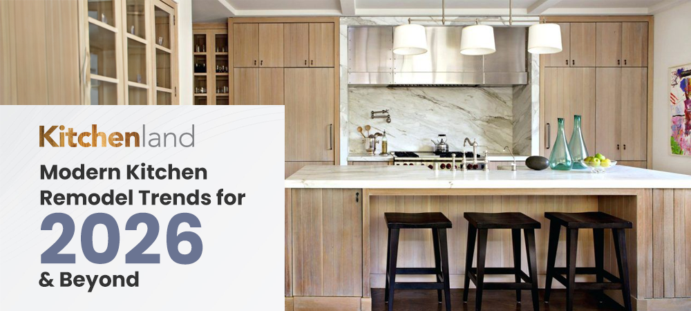
Organic textures and visible wood grains, like Kitchenland’s Tahoe Shaker, are back. 23% of renovating homeowners chose wood cabinets, for a feeling of authenticity and craftsmanship.
| Color Family | Why It's Popular | Best For... |
|---|---|---|
| Warm Whites & Creams | Offers the brightness of white without starkness. Creates a soft, inviting backdrop. | Small kitchens, traditional or farmhouse styles. |
| Soft Grays | The ultimate neutral. A blend of gray and beige that complements warm and cool accents equally well. | Modern and transitional designs. Excellent choice for perimeter cabinets paired with an island color. |
| Earth Tones | Connects to the rise of authentic, nature-inspired design. Adds sophistication and depth. | Rustic, Mediterranean, or organic modern kitchens. |
| Dark Accents | Offers dramatic contrast and a high-end, sophisticated look. | Lower cabinets or islands in two-tone designs. Large, brightly lit kitchens. |
Finishes and Textures That Transform Your Cabinets
As homeowners lean into expressive, nature-inspired design, the finish you choose can completely transform how a cabinet color feels in your space.
Matte Finishes
Matte finishes continue to lead 2026 cabinet trends for their soft, tactile quality. It will grow at a CAGR of 8.1%. They help reduce glare, hide fingerprints, and give kitchens a calm, sophisticated vibe.
Satin Finishes
For those who prefer a gentle glow, satin finishes strike the perfect balance. By 2026, glossy finishes will have about 35% of the market share. They maximize depth in warm neutrals and wood grains.
Natural Textures
Designers are favoring visible wood grains, rift-cut oak, and hand-brushed finishes that highlight craftsmanship. Pairing organic wood tones with painted uppers creates a layered, custom look that feels both timeless and personal.
The Rise of Two-Tone Cabinets
- Warm neutrals + dark blue
- Muted green + natural wood
- Soft gray + white
The Takeaways
All-white kitchens are slowly giving way to soothing greens, deep blues, and cozy warm neutrals. Matte finishes and two-tone cabinets bring depth and personality, creating spaces that feel stylish, welcoming, and full of character. Discover the Kitchenland cabinet collections today.
FAQs
Which cabinet colors are trending?
Soft greens, warm neutrals, deep navy, and natural wood tones are set to dominate.
How do I choose the right cabinet color?
Start by considering your flooring, countertops, and overall kitchen style. Test several samples in the actual lighting of your space before making a final decision.
Are bold colors like terracotta or plum suitable for kitchens?
Absolutely, bold colors work best as accents, adding personality. Pair them with neutral tones to maintain balance and harmony.

